


I’ve been wearing some rendition of a deep roasted cherry nail polish for over a decade. It’s my staple. Essie, Chanel, OPI and, in a last-minute emergency, Essence. I have preferences, but I can be practical.
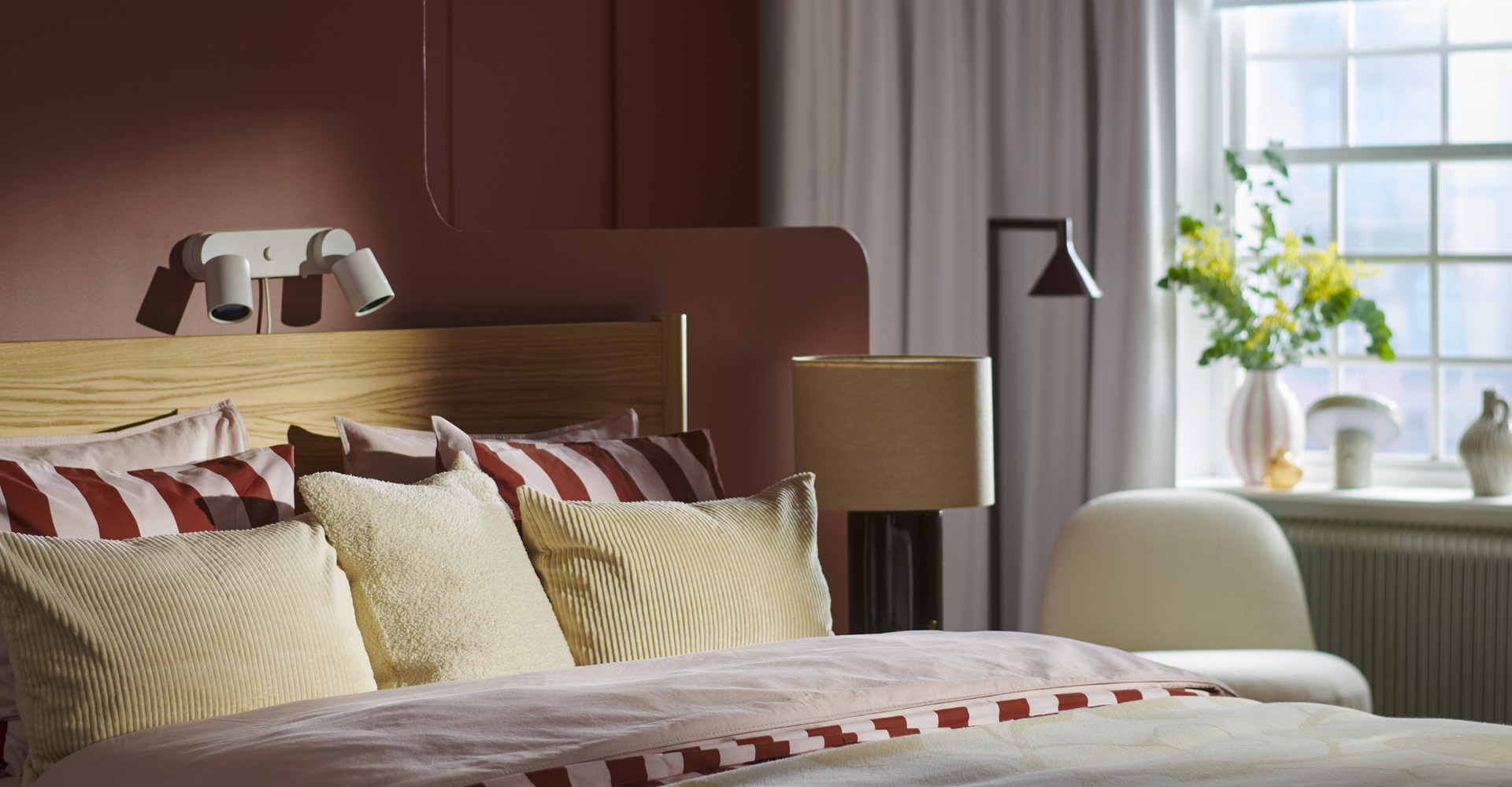
IKEA’s colour of the year for 2027, Wild Fig, belongs in familiar company: a deep, purple-leaning wine shade with relatives in the beauty cabinet and the wardrobe.
Chanel’s Rouge Noir first appeared backstage at the autumn/winter 1994 show; the house dates the nail lacquer’s launch to 1995. In 1996, Gwyneth Paltrow wore Tom Ford’s red velvet Gucci suit to the MTV Video Music Awards. These are references within a wider colour family, rather than exact matches, but they give IKEA’s selection a particular resonance.
What makes it right for the home in 2027? I put the question to Abbey Stark, IKEA’s Home Furnishing Direction Leader, in a written Q&A.
"I think what makes Wild Fig feel right for the home in 2027 is the balance it strikes between comfort and self-expression," she writes.
"One of the biggest things we're seeing is that people want their homes to feel more personal and reflective of who they are, rather than perfectly polished or coordinated," she writes. "They still want spaces that feel warm, comfortable and restorative, but they're also more willing to experiment with color and make choices that feel uniquely theirs. That was an important consideration in choosing Wild Fig."
The 2027 style guide gives that thinking a setting. A Wild Fig folding side table hangs against a pale pink wall, beside an electric-blue door. It is a compact piece with considerable presence. Elsewhere, the retailer encourages communal living rooms, sentimental possessions and furniture from different periods.
IKEA wants us to become more comfortable with a room unfinished.
Three paint colours to pair with IKEA's Wild Fig
- Slipper Satin No. 2004 - Farrow & Ball A chalky off-white that provides a soft backdrop for burgundy accessories, dark wood and patterned textiles.
- Rolling Fog 143 - Little Greene A warm, historic neutral that works beautifully with traditional joinery, antique furniture and richer textiles.
- Slaked Lime 105 - Little Greene A soft mineral white with enough warmth to complement Wild Fig's red undertones. Think easy linens and grounded oak.
Wild Fig is hardly appearing in isolation. Burgundy, aubergine and deep wine shades have been finding their way into interiors for some time, from the more playful, whimsical end of contemporary decorating to heritage homes where dark wood, patterned fabrics and richly coloured walls have long been comfortable companions. They are equally at home in contemporary retail, where deeper palettes can lend even the most modern spaces a sense of character and permanence.
Part of the appeal is that these colours are difficult to place in a single decade. They recall the velvet tailoring of the 1990s, the indulgent interiors of the 1970s and the traditional drawing rooms that preceded both. They can feel nostalgic without requiring an entirely nostalgic setting.
That makes Wild Fig an interesting choice for IKEA, a retailer more readily associated with practical Scandinavian design than decorative indulgence. The colour introduces richness without necessarily demanding a complete change of furniture. A painted cabinet, a new textile or a small decorative object can introduce it into a room that has otherwise remained unchanged.
And the timing feels particularly apt. As interiors become more eclectic, with inherited furniture, vintage finds and contemporary pieces increasingly sharing the same room, Wild Fig has the advantage of looking as though it might have been there all along.
Images: IKEA.