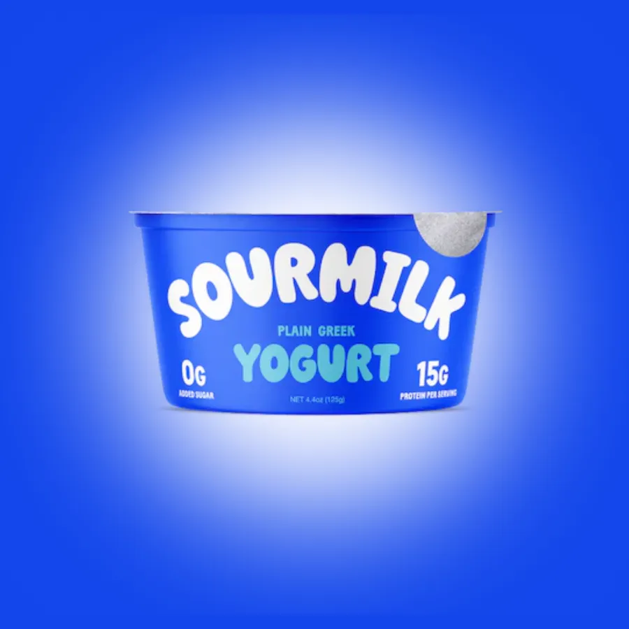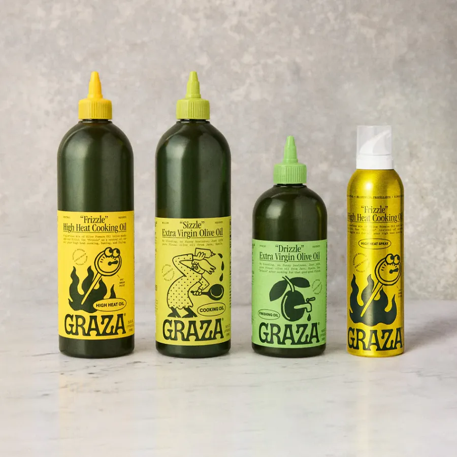



First up, Riser co-founders Paul Marcucilli and Camila Drozd on rethinking Bloom’s visual identity, challenging category conventions and knowing which brand assets are worth keeping.
Founded in 2019 by Mari Llewellyn and Greg LaVecchia, Bloom Nutrition was already a fast-growing supplement business when Riser’s redesign of its identity launched in June 2022.
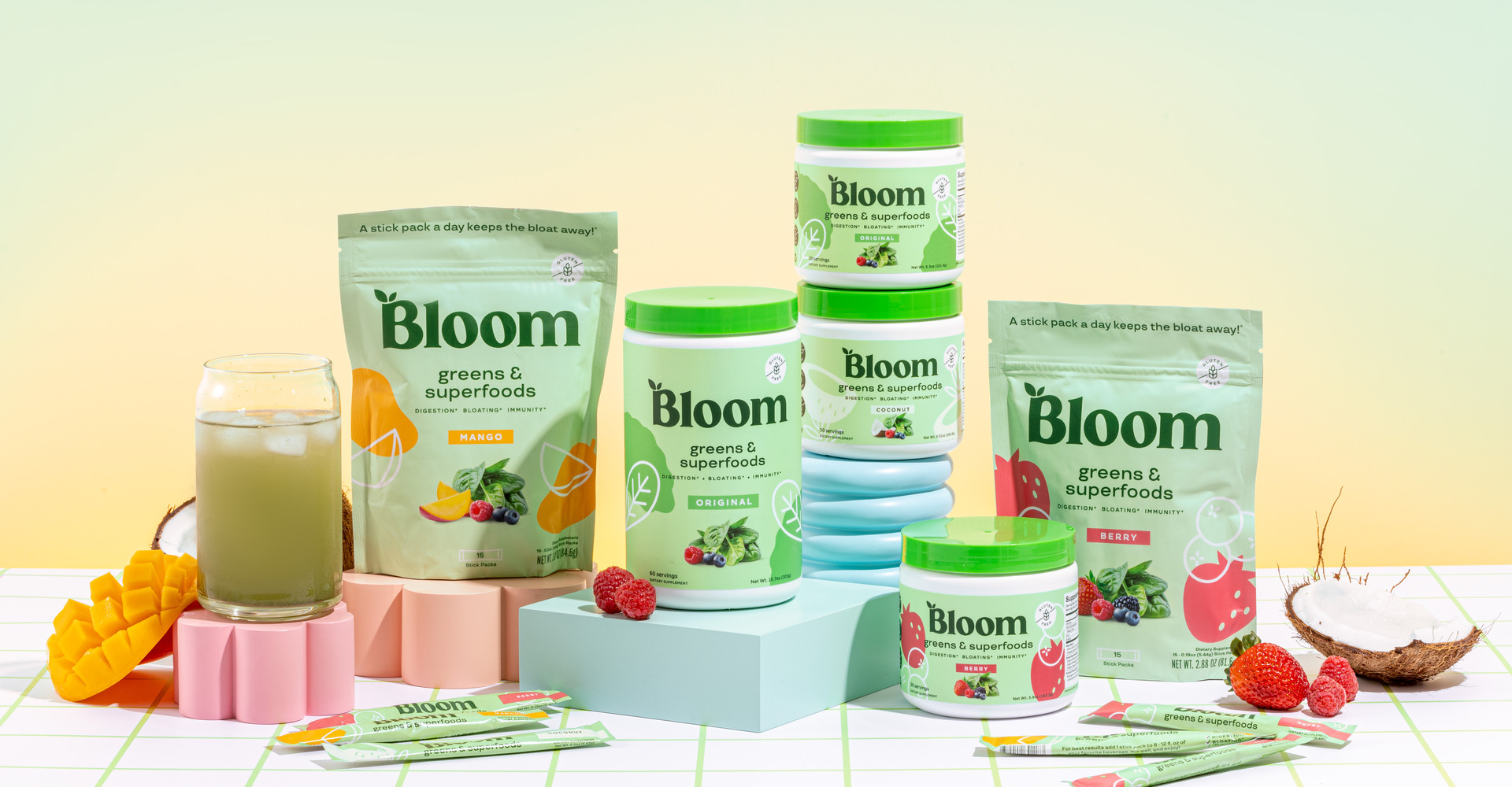
What began with two products became a redesign spanning more than 60 SKUs.
Since then, Bloom has expanded well beyond its original greens powders. The company entered Walmart in 2023, secured $90 million in financing led by Nutrabolt in 2024 and launched its first sparkling energy drinks that same year. Nutrabolt subsequently took a majority stake in 2025, bringing its total investment to more than $200 million.
The commercial transformation has been considerable. Bloom generated approximately $175 million in annual revenue in 2023, according to Inc., while Forbes reported the business reaching $500 million in annual revenue in 2026.
Beverages now account for 75–80% of sales. Its sparkling energy range includes Crisp Apple, Peach Mango and the new Strawberry Shortie.
What was the original brief, and what did you end up challenging?
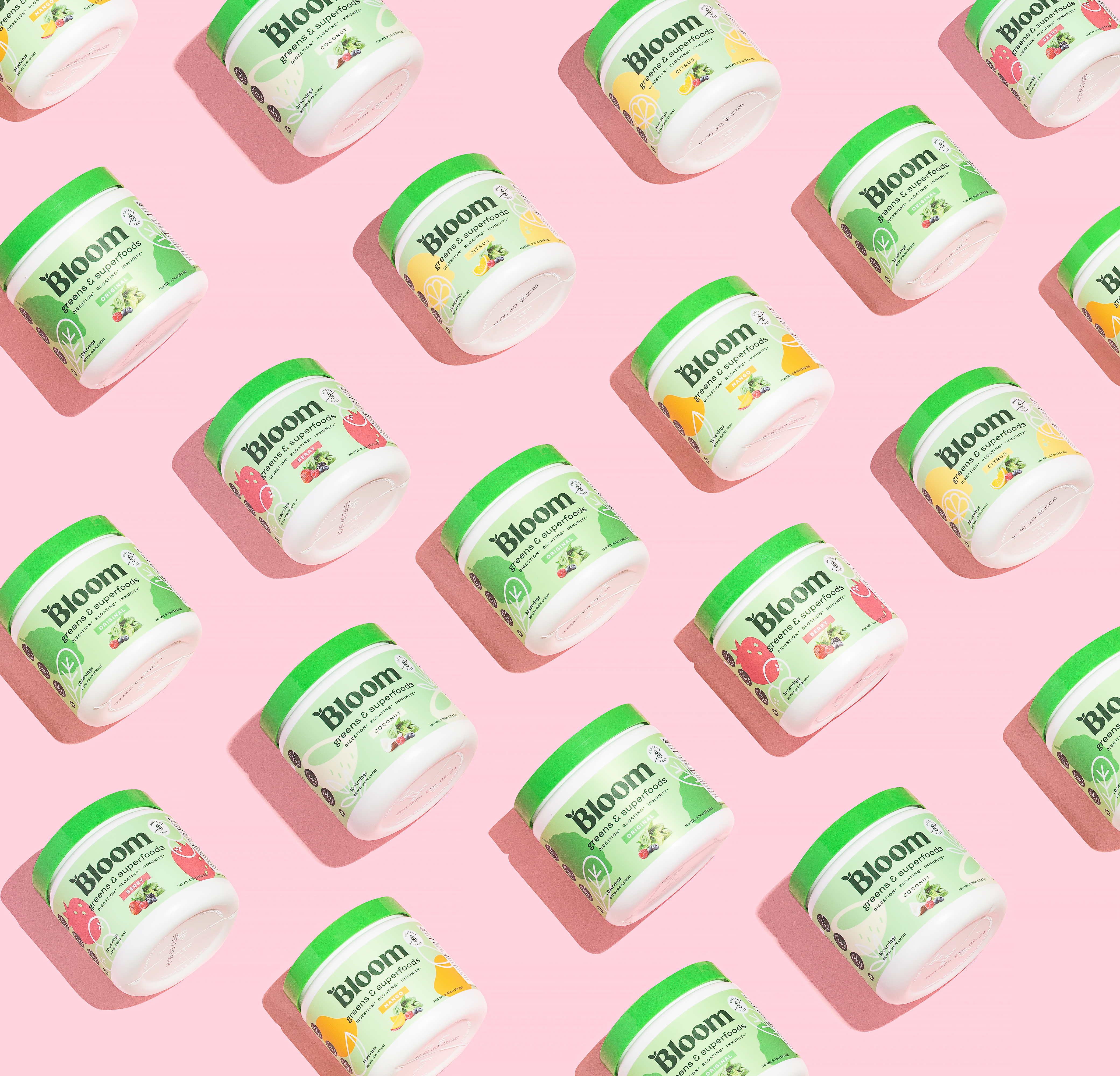
Bloom came to us looking to evolve their packaging as they prepared to enter retail. They wanted something fresh, modern, and more appealing to a female audience. They also wanted to make flavor a bigger focus, with packaging that felt more appetizing and highlighted the products' unique flavors.
Initially, they weren't open to changing their logo, but we felt there was an opportunity to take the brand further. So we suggested showing them what a new identity could look like in our first round of concepts. Once they saw it, they were on board.
We also challenged their use of the standalone “B” on packaging. Bloom is such a great name, and we felt it deserved to be front and center. Moving to the full wordmark gave the brand more personality and a stronger presence on shelf.
What makes a brand distinctive today, beyond a recognisable visual identity?
Having a strong visual identity is important, but it's really only one piece. The brands that stand out have a clear point of view and know what they're about.
It's everything from how they communicate to the experiences they create and how they make people feel. You can have the most beautiful packaging in the world, but if there's nothing meaningful behind it, it's hard to build a lasting connection.
When does breaking a design rule make something better?
When there's a good reason behind it. We don't believe in being different just for the sake of it, but we do believe in questioning what's expected.
There's a lot of sameness in CPG, and it's easy for brands to fall into the same visual trends and category conventions. For us, it's about finding what makes a brand unique and building on that, even if it means going against what everyone else is doing. Sometimes the rules are worth following, and sometimes they're exactly what's holding a brand back.
When does your personal taste become an asset to the work, and when a limitation?
Personal taste is exactly that, personal. It's shaped by our experiences, the places we've been, the people we've met, and all the little things we pick up along the way. That's a big part of what keeps us inspired and brings something different to our work.
But at the end of the day, we're not designing for ourselves. We're designing for a brand, its audience, and its goals. Our taste definitely influences how we approach things, but we have to be open to ideas that might not be our personal preference. Not every brand should look like something we'd personally buy.
To what extent should design reflect its culture, and to what extent challenge it?
It's a bit of both. Culture influences so much of what we do, whether we're conscious of it or not. What people are drawn to, how they communicate, what feels relevant. All of that plays into design.
But we also think there's a difference between being aware of what's happening culturally and just following trends. We're more interested in understanding why something resonates with people and finding our own way to build on it. Sometimes that means embracing what's familiar, and other times it means challenging it.
What's something beautifully designed that you use every day?
Our iPhones. It's probably an obvious answer, but there's a reason for that. The attention to detail, simplicity, and how intuitive everything feels is pretty remarkable. It's one of those products we use constantly without really thinking about how much design went into making it feel so effortless.
If we opened your camera roll right now, what would we find?
A very random mix of packaging, interesting typography and signage, landscapes, sunsets, and photos of family. We're always taking pictures of things that catch our eye, whether it's something beautifully designed or just an interesting moment. And probably way too many photos of our pets.